

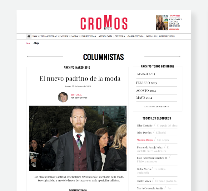
Blogs Cromos 2015
Cromos magazine is one of the most widely read magazines in Colombia, its content is focused on a female target. In both the printed and digital versions, blogs/columns are a very important space, where writers, authors, journalists, and collaborators deal with different topics.
Categories
- UI
Role
- UI design
Duration
- 1 Month
Client
- Caracol Televisión
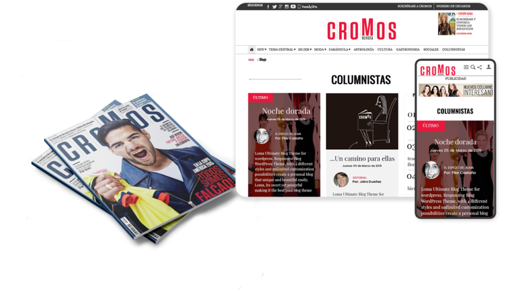
Redesign was the starting point
After a big makeover in both the logo and the structure of the magazine, they wanted to give a big change to the website and of course to the blog section.
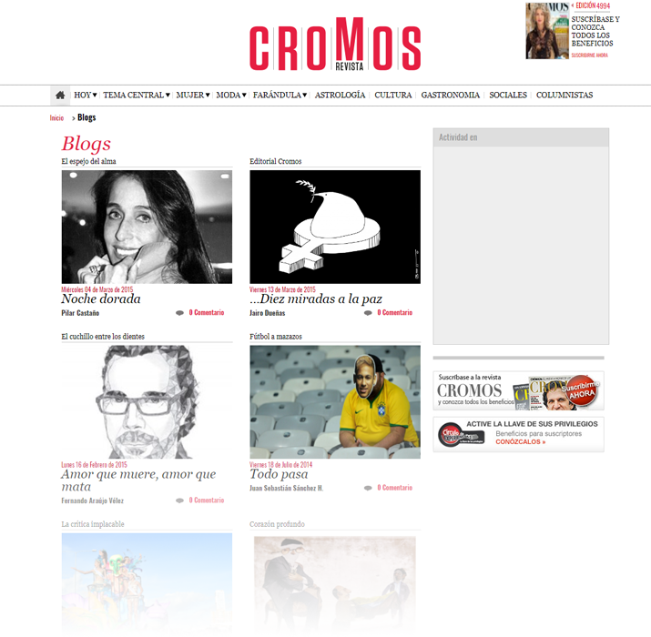
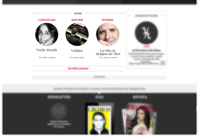
Previous design of the blog section
Developing the concept
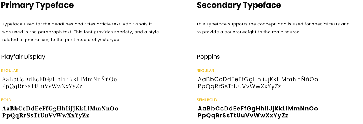
The design concept is about the union between the art of writing articles and modern communication of the digital world. For this concept, a traditional visual language was used, closely related to printed media such as newspapers and magazines.
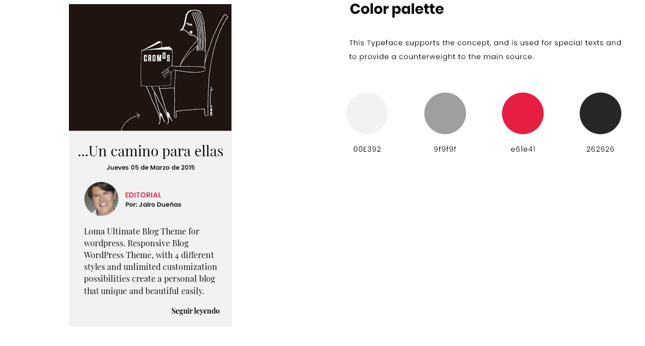
In order to fill the concept, the selection of the typeface was an important step. The best choice was a serifed typeface faced with a sans-serif typeface, with this the concept of the traditional with the modern is embodied. Similarly, the color palette was reduced.
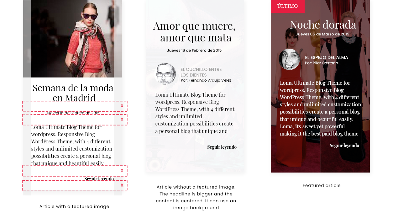
A dynamic three-column grid was created. For the presentation of articles, three options were created through the pattern of letters to generate dynamism in the section.
Final mockups
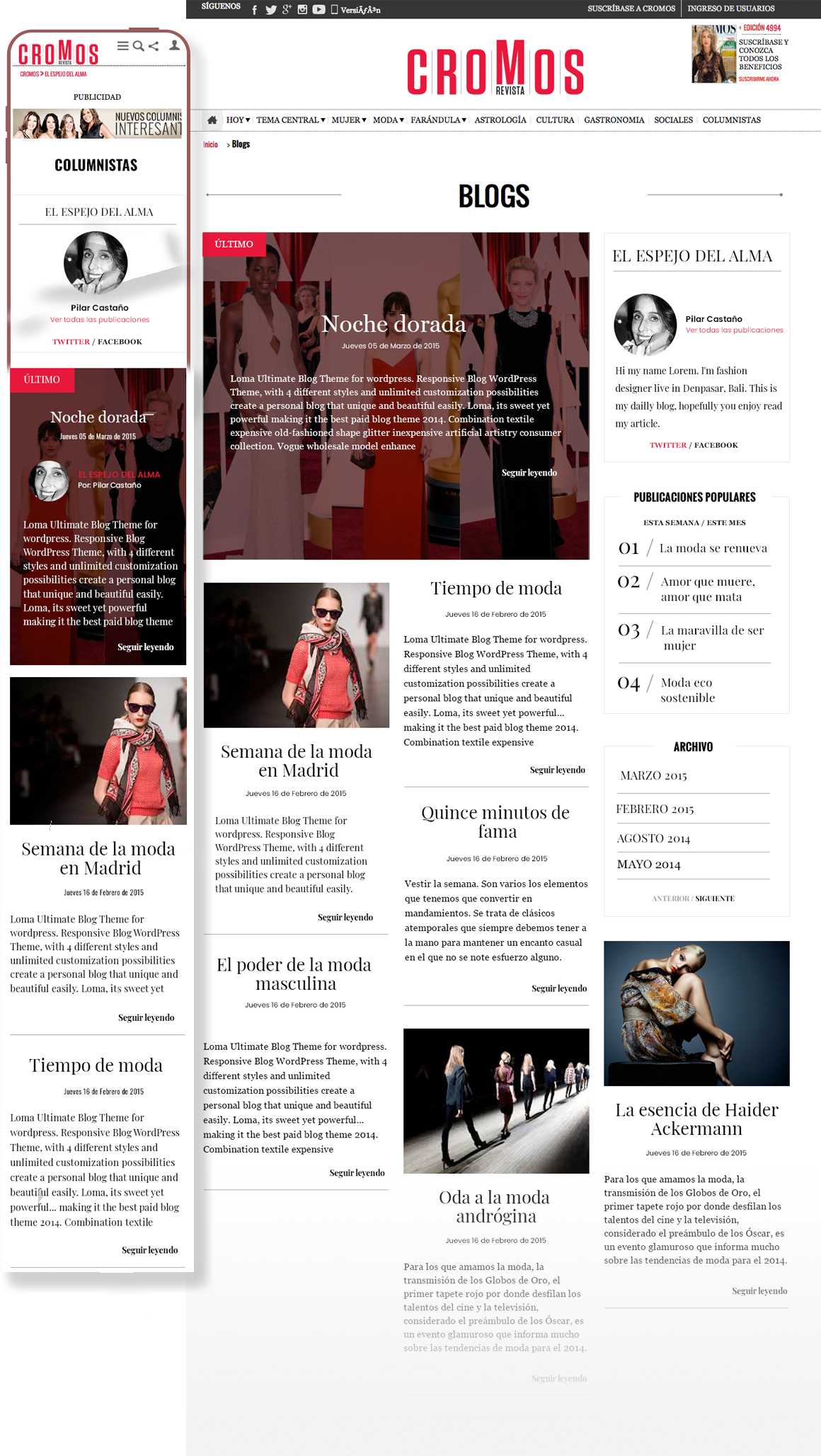
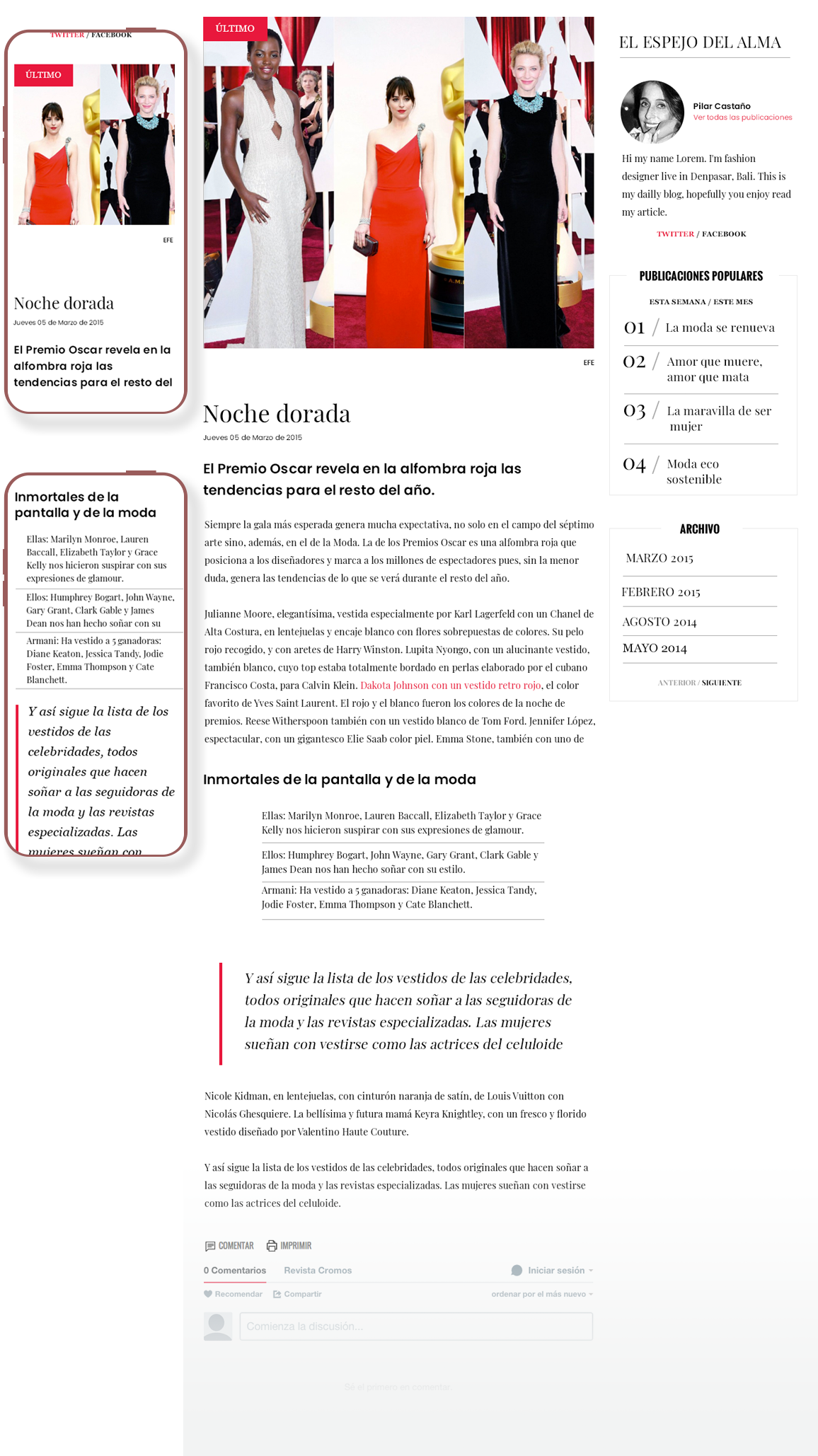
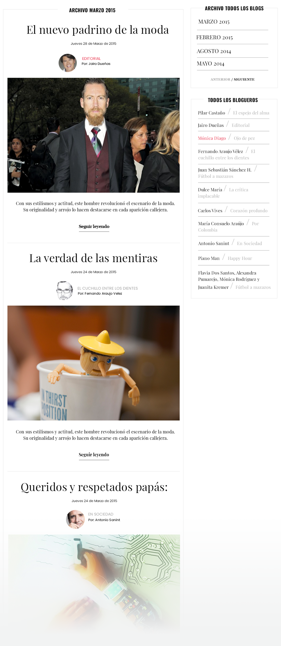
The final design includes the location of the blogs in the home site, the blog home site, the list of articles, details of the article, articles history, and the mobile version of each section.