


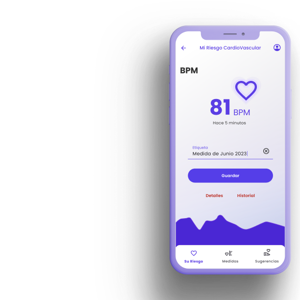
Corazón saludable
Categories
- UX/UI Designer — research
- Prototyping
- Mobile Health
Role
- UI design
Duration
- 5 Months
Client
- Fundación Cardioinfantil
The one minute version
What Corazón Saludable is
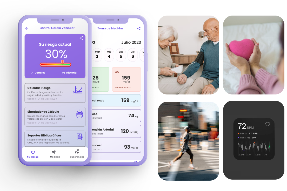
Corazón Saludable is a mobile health diary that helps Colombians track the numbers behind heart disease — blood pressure, weight, cholesterol, HDL, LDL and resting heart rate — and translates them into a single, understandable cardiovascular-risk indicator.
A guided risk calculator, a motivating dashboard, a weight-management view, and a gamified library of articles, tips and exercises turn an abstract, frightening topic into small, repeatable daily actions. My job was to make clinical data feel human: legible at a glance, honest without being alarming, and rewarding enough to come back to.
The problem
Colombia’s biggest killer is also its most preventable.
Cardiovascular disease leads deaths in Colombia, yet the risk factors — blood pressure, weight, cholesterol, smoking — are invisible until they aren’t. People measure a number at the clinic, forget it by the bus ride home, and have no way to see whether they’re getting better or worse.
~30%
of all deaths in Colombia are cardiovascular — the country’s leading cause of death.
~80%
of cardiovascular events are considered avoidable through prevention and habit change.
152
CVD deaths per 100,000 people, concentrated in lower-income regions.
5+
separate numbers a person must track and interpret — with no single, plain-language verdict.
Sources: European Heart Journal (DANE mortality data, 2008–2017); Colombian cardiovascular-risk study, PMC; Colombia Ministry of Health / Our World in Data. Figures illustrative for a portfolio concept.
Insight 01
“Is that bad?”
People can read a blood-pressure number but not judge it. Raw data creates anxiety without direction. They wanted a verdict, not a spreadsheet.
Insight 02
Fear ≠ action
Scare tactics made people avoid the app. Motivation came from small wins and visible streaks. Progress had to feel encouraging, never accusatory.
Insight 03
Two hands
Older users often log with help from an adult child. The app is used by a patient and a caregiver — clarity has to survive being passed between them.
Discovery
What I heard, and what it meant
I ran 6 interviews with adults managing (or worried about) heart health, a review of 4 comparable trackers, and a synthesis workshop. Three insights shaped every screen that followed.
Who it’s for
Three people, one heart to look after
Personas built from the interviews. They span the reality of preventive care in Colombia: the person at risk, the person preventing, and the person helping.
Jairo Restrepo
“The doctor said my pressure is high. I don’t really know what the number is supposed to be — I just know I got scared.”
Context
Hypertensive, smokes half a pack a day, mostly sedentary behind the wheel. A friend’s recent heart attack rattled him into paying attention.
Goals
- Know if he’s actually in danger — in plain words
- Do something without a gym or a diet plan
- Not feel lectured
Frustrations
- Numbers mean nothing to him alone
- Health apps assume he tracks everything already
Digital comfort
Marcela Ospina
“My dad had a bypass at 60. I want to see my numbers trend the right way — and I like ticking things off.”
Context
Family history of heart disease. Health-literate, motivated, already logs steps. Wants prevention and to model good habits for her kids.
Goals
- Keep cholesterol & weight in range
- Learn credible, bite-sized health info
- Stay motivated over months, not days
Frustrations
- Advice online is generic and US-centric
- Trackers get boring after week two
Digital comfort
Daniela Restrepo
“I set up the app for my dad and check in on his readings. If something spikes, I want to catch it before he does something dumb.”
Context
Jairo’s daughter and de-facto caregiver. Tech-fluent, time-poor. Represents the family-centered reality of care in Colombia.
Goals
- Help her dad log without doing it for him
- See trends, not just today’s number
- Understand what a reading means clinically
Frustrations
- No easy way to support a parent remotely
- Data she can’t interpret is useless
Digital comfort
Structure
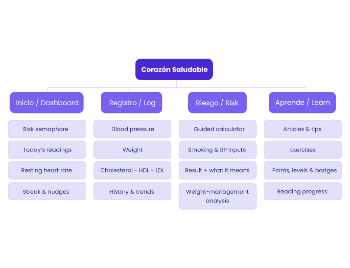
Information architecture
Four thumbs-reach destinations. Everything a person needs day-to-day lives one tap from the dashboard; deeper analysis and learning sit behind clear entry points.
Key flows
How the core tasks move
Three flows carry most of the value. Each is short by design — the fewer steps between opening the app and feeling informed, the more likely people are to keep logging.
Flow A · First-run & first risk verdict

Design decision: the very first session ends on a verdict, not a form. People leave run #1 already knowing where they stand and what one action to take.
Flow B · Daily measurement log

Design decision: values echo back in a device-style monospace readout with an immediate color cue, so a person knows if today’s number is healthy before they even close the sheet.
Flow C · Learn & earn (gamification)

Design decision: points reward learning, not vanity metrics. The more you understand your heart, the higher your score — knowledge is the game.
Experience over time
Jairo’s journey: from scared to steady
Mapping the primary persona across the emotional arc — from the doctor’s warning to a maintained habit — surfaced where the product must reassure, and where it must reward.
| 1 · Scare | 2 · First open | 3 · The verdict | 4 · Building the habit | 5 · Maintaining | |
|---|---|---|---|---|---|
| Doing | Leaves clinic with a scribbled BP number and a warning. | Downloads app after his daughter Daniela sets it up. | Runs the guided risk calculator; enters BP + smoking. | Logs BP most mornings; reads a short article now and then. | Checks the semaphore weekly; sees his risk band improving. |
| Thinking | “Is this serious? What does 150/95 even mean?” | “Another complicated app I won’t use.” | “Okay — moderate risk. One thing to change: smoking.” | “That was quick. And I got points for reading.” | “I’m actually moving in the right direction.” |
| Feeling |
Anxious, in the dark
|
Skeptical
|
Sobered but clear
|
Encouraged
|
In control
|
| Opportunity |
Meet fear with clarity, fast. |
Prove simplicity in the first 30 seconds. |
Give a verdict + exactly one next step. |
Reward consistency; keep logging under 15s. |
Make trend improvement visible & shareable with Daniela. |
The design problem wasn’t showing data. It was answering one question “is my heart okay?” — every single day.
Brand & system
A visual language: clinical trust, human warmth
Health apps default to cold blue or alarm red. Corazón Saludable needed to feel medically credible and reassuring — Colombian warmth without the panic of a red heart. The system below is applied live on this page.
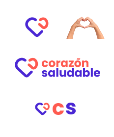
Logo & mark — “El Latido”
The symbol combines two complementary ideas: the heart and the act of caring for it.
The purple shape can be read immediately as a stylized heart, but its open, continuous form also suggests a protective gesture or embrace. The red element reinforces the cardiovascular meaning while creating the visual impression of a heartbeat/pulse moving through the symbol.
Color — brand palette
Ink
#333333Salud Teal
#3F1FD4Latido Coral
#FE5B50Mint Paper
#E0F3E1Teal Soft
#E4F4FDCoral Soft
#FF9992Color — risk semaphore (functional only)
Bajo / Low
#2AAF6EModerado / Mid
#E8A317Alto / High
#DB4A4AKey decision: the brand accent is coral, not red. Red, amber and green are reserved strictly for the risk semaphore, so the app can never confuse “our brand” with “you’re in danger.” Coral carries warmth and vitality without triggering alarm.
Key screens
The color system was designed around clear emotional and functional cues:
- Green represents safety, confirmation, and successful check-ins. When users report that they are safe, the interface transitions to green states, providing immediate reassurance.
- Red is reserved for attention-required states, pending check-ins, or situations that may require user action. Its strong contrast helps communicate urgency without relying on excessive notifications.
- Neutral grays and soft backgrounds reduce visual noise and allow critical actions to stand out, while maintaining a calm and reassuring experience.
This deliberate use of color creates a clear status system that users can understand at a glance, even in high-stress situations.
