

Fly UX
Case studieWhat new can we bring to an airline website? Probably nothing, but as UX challenge, is a gripping experience. I discovered new ways to enrich the interface design of a website. But by listening directly to the users, I could see what elements might be appropriate for a specific site.
Categories
- UX
- Wireframes
Role
- UX design
Duration
- 6 Months
Client
- Ux Institut
Defining…the problem
The problem to resolve is the creation of an airline website based on a complete UX research to identify the common problems when a User searchs for a flight and select seats. I realize a competitive benchmarking with airlines websites that I have used before.
The project followed this path:
- Competitive benchmark
- Online Surveys
- Analysis of previous usability test (Note taking)
- Usability tests
- Affinity diagram
- Customer journey map
- User flow diagram
- Interaction design
- Prototype
- Wireframes
Competitive benchmark
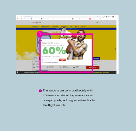
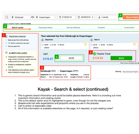
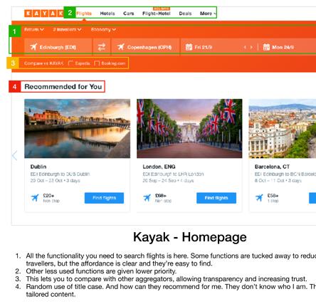
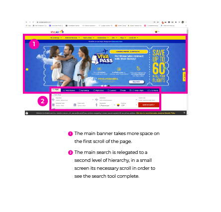
The best way to kick off this project was the review of two websites. The exercise highlights how the competitors resolve the navigation, the design of the home site, the way of searching for tickets and the selection seats. I assed what had been done and possible paint point. This analysis involves Avianca Airlines (airline from Colombia) and Viva air (low-cost airline from Colombia).
Online survey
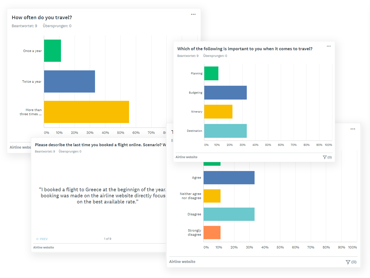
Through the service Survey Monkey, I created a simple survey with open and closed questions as well some multiple-choice questions totaling ten question. This was to get quick insights from the potential design target and was completed by 9 participants.
Questions:
- What was most important when booking that flight?
- Which of the following is important to you when it comes to travel?
- Please describe the last time you booked a flight online. Scenario? When did you make the decision?
Affinity diagram
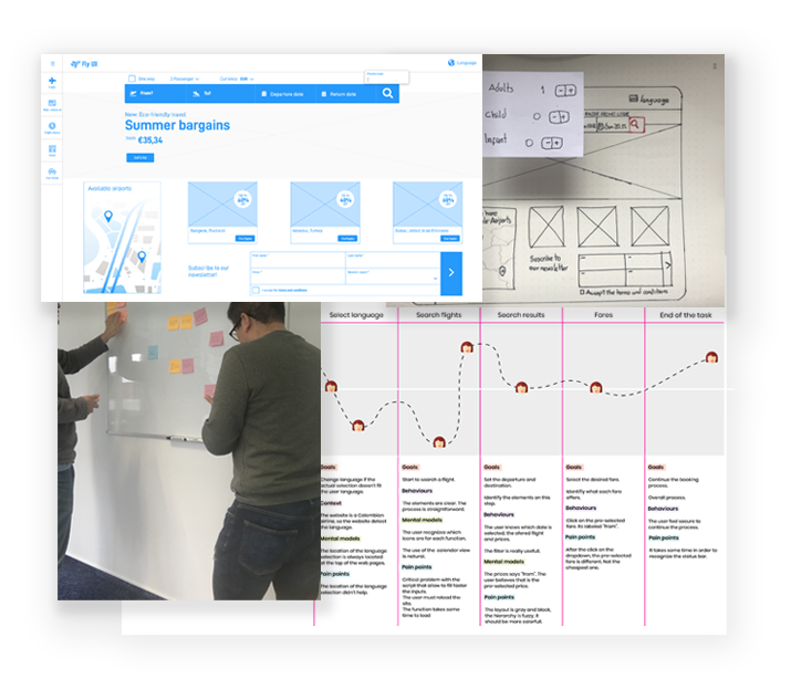
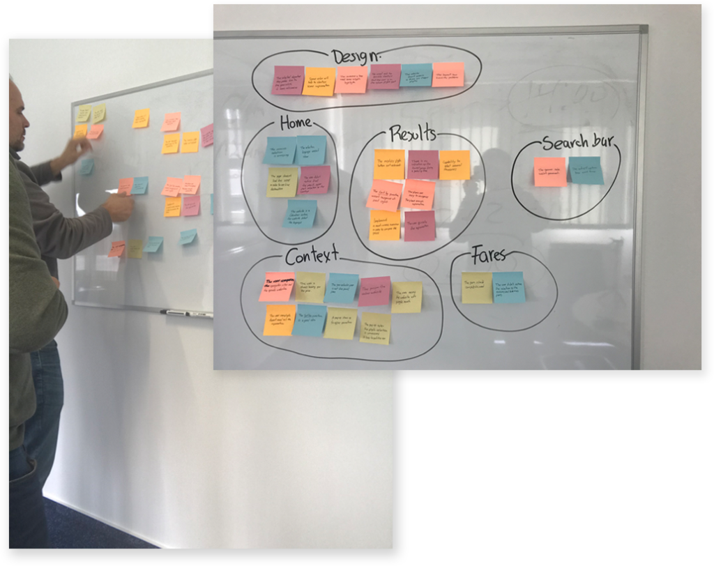
After collecting the information. I brought in a colleague and we went through all the usability test and depth interview recordings, the surveys and took notes. I made a note of everything that I felt is relevant to describing the current user experience: goals, behaviors, paint points, mentals models and contextual information.
We grouped the information in 6 groups: Design, home , flight results, search bar, context, fares.
Usability test
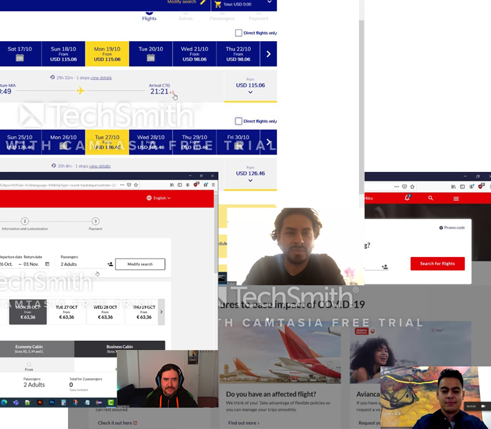
I conduce two usability tests with four different users. For each session, the user had to complete tasks on two different airline websites (Avianca & Viva air). The comparative tests were a great insight to see how well or badly different airlines try to solve the same problem.
Were defined two tasks: search for a flight with specific conditions and select a seat.
Customer journey map
Based on the affinity diagram, I created a customer journey map to define the high-level steps in the journey. The steps were made in accordance with the high-level grouping made in the affinity diagram.
For each step in the process, I documented goals, behaviors and pain points. After assessing whether the experience was positive or negative.
User flow diagram
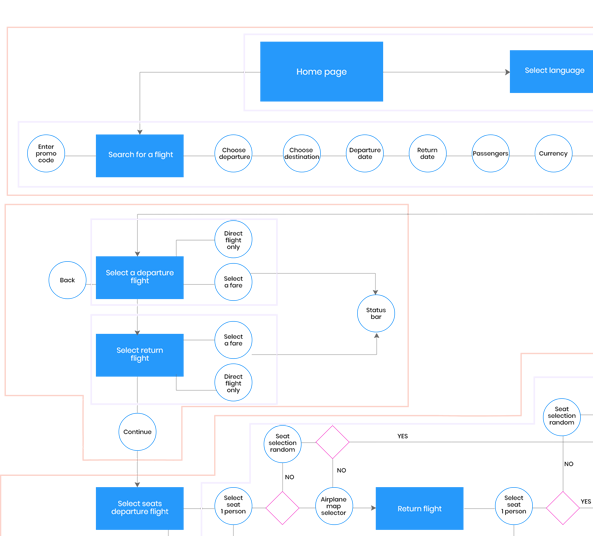
Before the design step, I stablished a main task where the user searches for a flight and select a seat. I sketched out the diagram and defined how many screens and interaction will covert this task. One important result from the previous steps was the reduction of screens for a better and faster experience.
Interaction design
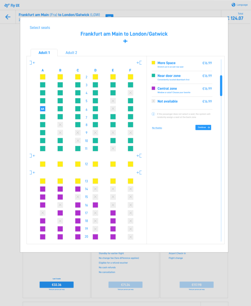
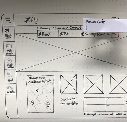
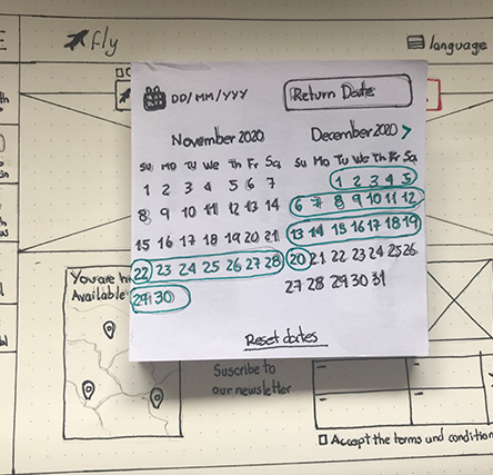
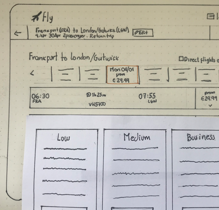
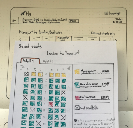
At this stage, I sketched the screens for the airline website. It starts from the homepage right through to the selection seats.
The screens show each interaction with maximum detail and following the user flow detailed in the previous step.
Prototype
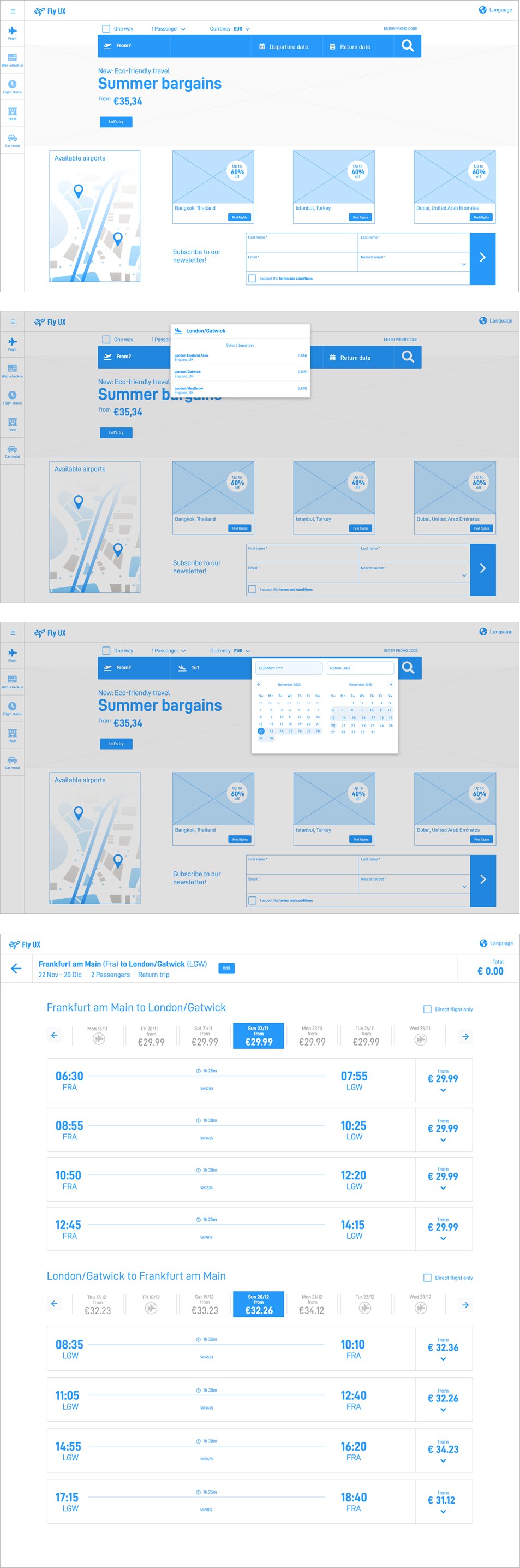
A medium-fidelity prototype was the best option in order to explain the functionality of each step in the process. I used Adobe XD and later shared with colleagues for a small usability test. I made sure it contains enough detail and interactivity to test the flow.
Wireframes
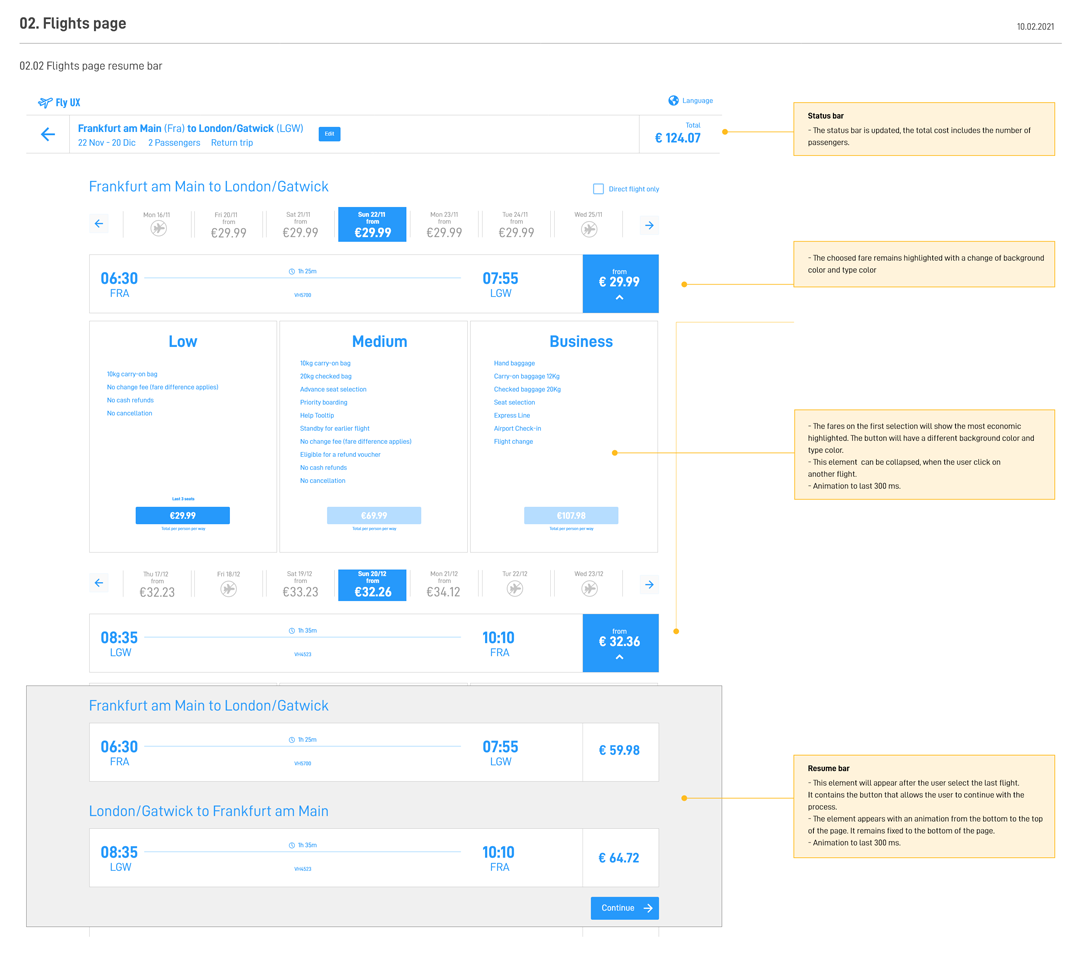
To make sure the deliverables contain all the necessary details a developer would need to build the website accurately, wireframes need to be included. Next to the traditional wireframes, I entailed all the specifics rules, behaviors and error feedbacks for each element.
Result
After the complete research, it was unexpected how many airline websites present paint points on their process. Of course there is no a rule or default solution for the airline market but The research concludes with something that for some is obvious, but less information on important steps such as finding flights the better and clean presentation of flight offers helps.
It is important to note that legal information, or pricing and rules can be relegated in the navigation hierarchy in order to reduce the amount of information to be displayed.