

BidX
BidX is a powerful bid management software designed to help businesses optimize their digital advertising performance through automation and data-driven insights. By leveraging advanced algorithms, BidX enables marketers to efficiently manage large-scale campaigns, adjust bids in real time, and maximize return on investment across platforms such as Amazon and Google Ads.
Categories
- UI
- Prototyping
Role
- UX/UI design
Duration
- 1 Year
Client
- BidX GMBH
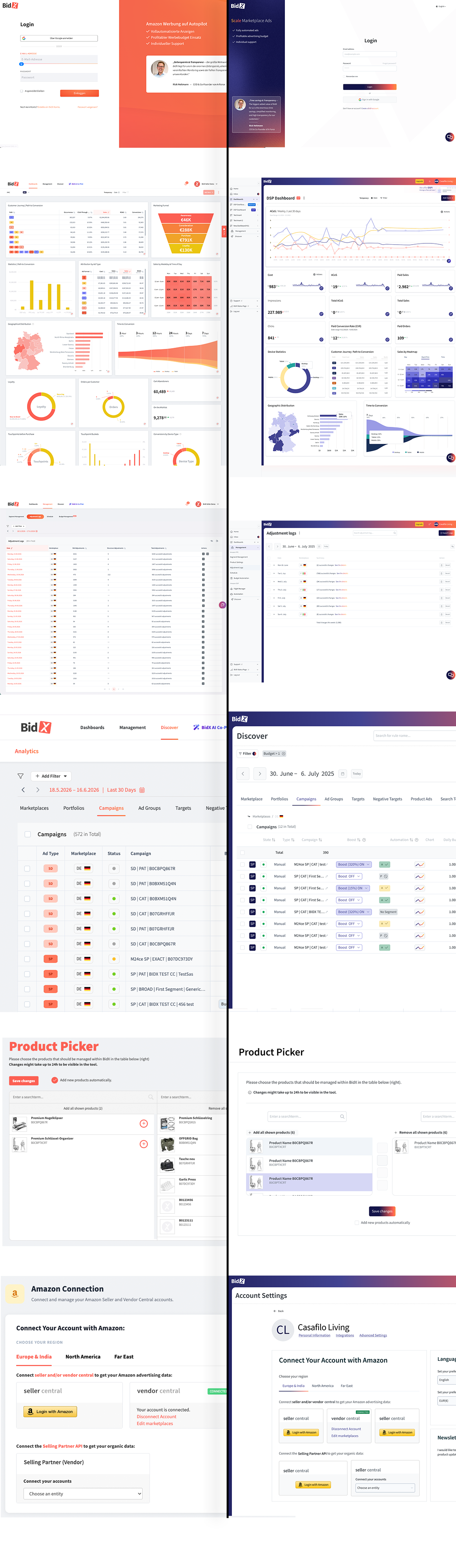
The primary goal of the bidx platform redesign was to foster cohesion and reliability through a cohesive design system. The process began with a “components-first” approach; using the Primevue4 framework, we established the tone and styles for each UI element. Similarly, the layouts were designed to make it easier for users to achieve their goals.
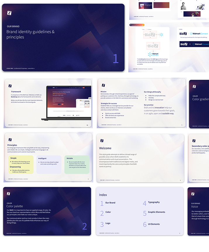
The Brand BidX
To launch this project, it was necessary to define the guidelines and tone of communication for the BidX brand. Key elements were refined, including the color palette, the communication concept, and all graphic materials designed to complement the brand.
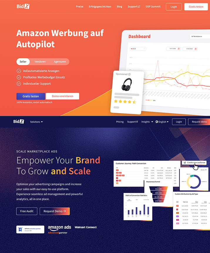
The website bidx.io
The rebranding led to an overhaul of the website.
This visual identity also served as the foundation for the platform’s redesign.
Why a Full Redesign Was Necessary
A heuristic evaluation revealed:
Usability Issues
- Users needed 6–8 clicks to complete core bidding actions
- Confusing navigation with overlapping menus
- No clear hierarchy between “active bids”, “drafts”, and “awarded”
Visual & Interaction Problems
- Inconsistent UI components across modules
- Poor contrast and accessibility compliance (WCAG failures)
- Dense tables with no progressive disclosure
Business Impact
- Increased training time for new employees (2–3 weeks onboarding)
- High error rate in bid submissions
- Low adoption of advanced analytics features
Next steps
UX Strategy, methods used
- Users reviews compilation
- Customer growth team members
- 5 usability testing sessions
- Competitor analysis (hellium10, teikametrics, junglescout)
Key Insights
- Users prioritize speed over customization
- Dashboards are used only if they are immediately actionable
- Trust in data accuracy is critical; unclear status labels reduce confidence
Core UX Problems Identified
- Navigation overload
- 12+ items in global nav without grouping
- Poor information hierarchy
- No separation between urgent vs archived bids
- Inefficient workflows
- Bid creation process scattered across multiple screens
- Weak feedback system
- Users unsure if actions were completed successfully
Design Goals
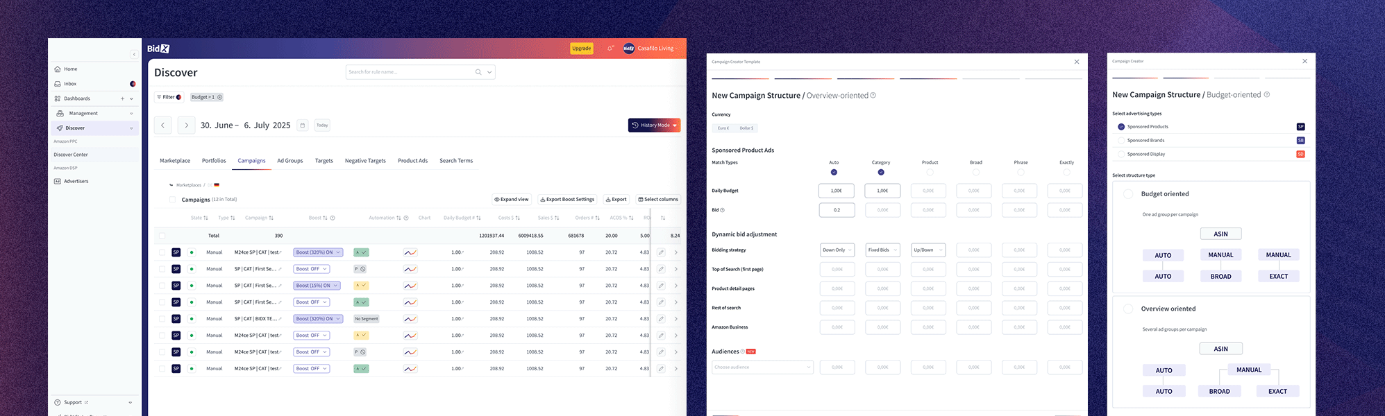
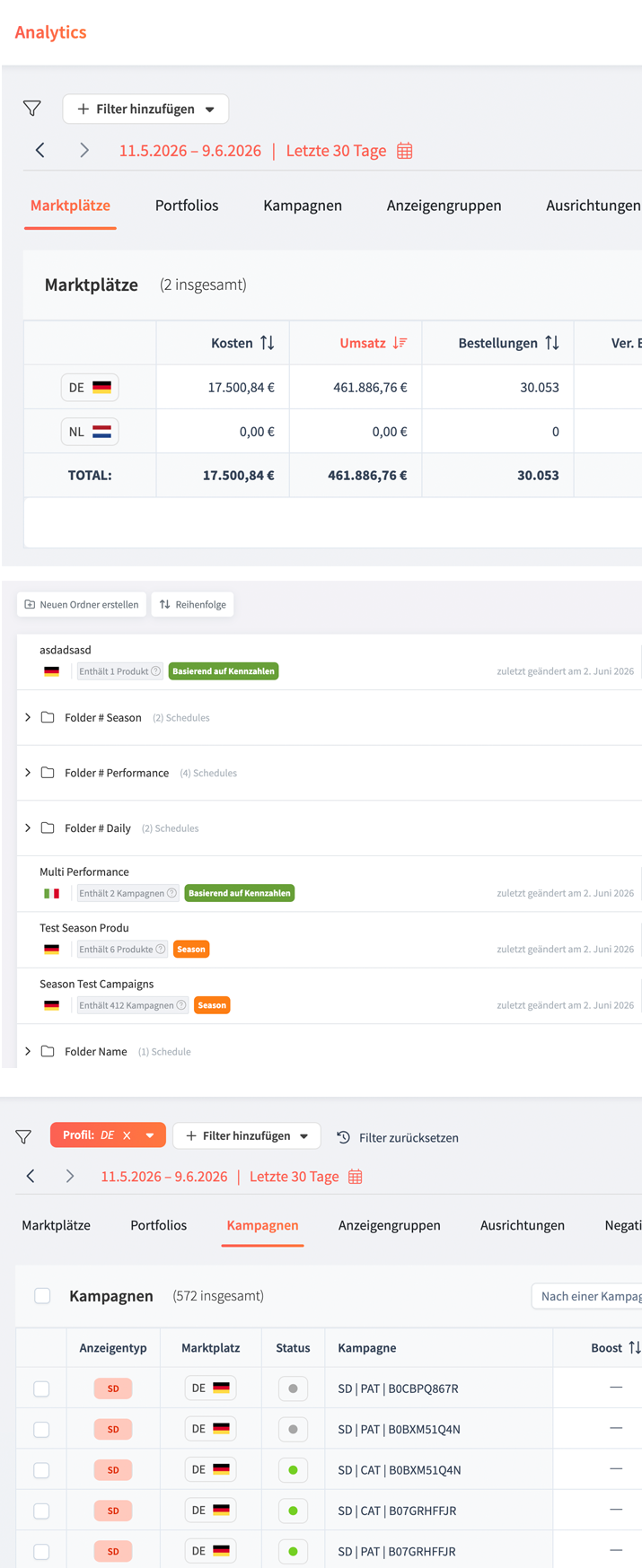
The redesign aimed to simplify navigation, streamline key workflows, and improve data visibility across the platform. My goal was to create a more intuitive experience that reduced friction for daily users while ensuring the product remained scalable and accessible.
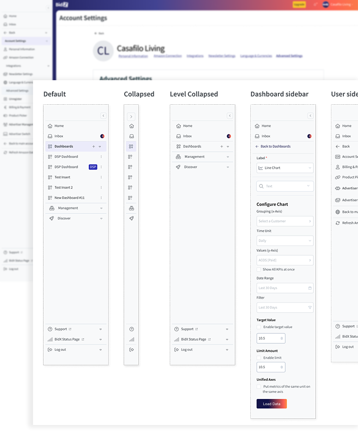
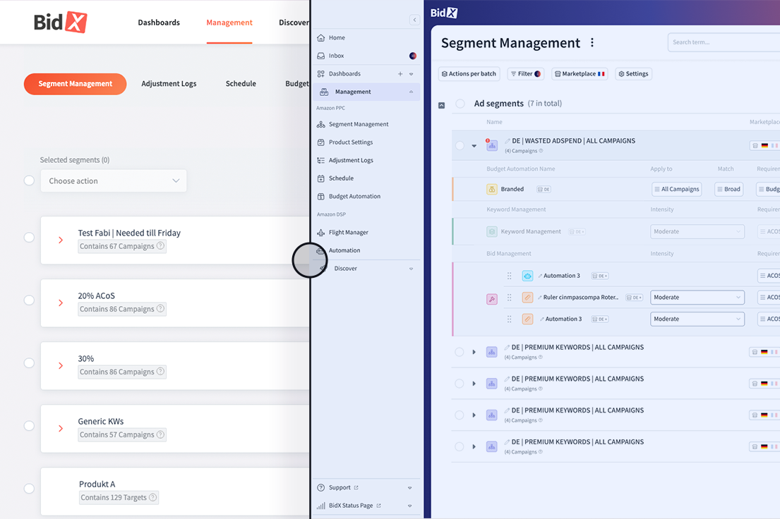
Adaptive Global Sidebar
A flexible global sidebar was introduced to provide contextual tools and actions without disrupting the user’s workflow. While maintaining a consistent structure across the platform, its content adapts to each module, surfacing relevant controls where they are needed most.
The sidebar can switch between expanded and collapsed states, optimizing screen space while supporting both navigation and task-specific actions. This approach reduces context switching, improves efficiency, and creates a more scalable experience across the platform.
Visual Design & Design System
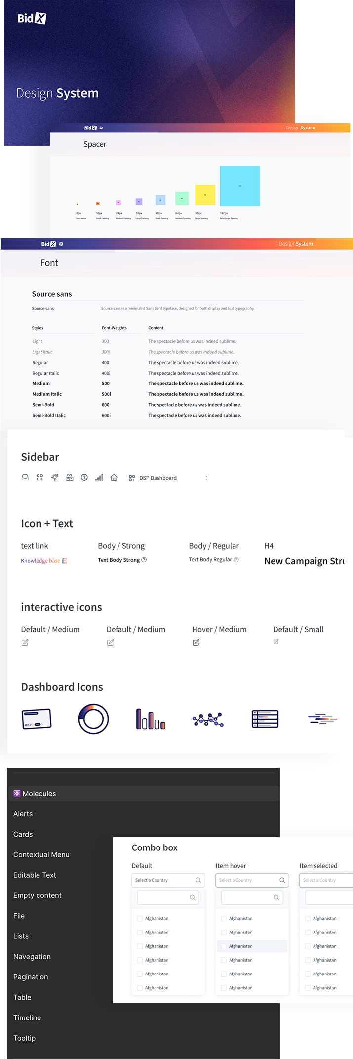
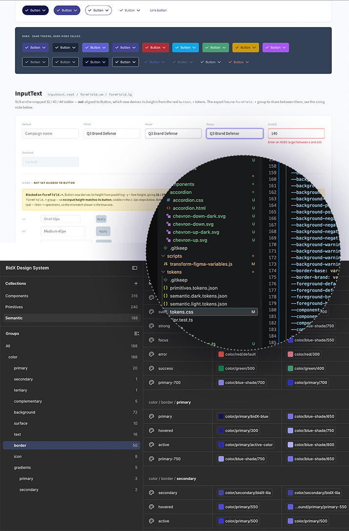
As part of the platform’s migration from PHP to Vue, I established a scalable design system that would align design and development from the start. To ensure consistency and facilitate implementation, the system was built around an 8px grid, creating predictable spacing, sizing, and alignment patterns across all interfaces.
The visual language was heavily inspired by the design principles and component architecture of PrimeVue 4 and PrimeFlex, enabling a seamless transition between design and development. By leveraging their established patterns for layouts, forms, data tables, and interactions, we reduced implementation complexity while maintaining a modern and cohesive user experience.
A library of reusable components, variables, typography styles, and responsive layouts was created to support future product growth.Figma was used for this porpose and it follows the concept of the atom design for its structure.
AI-assisted component generation
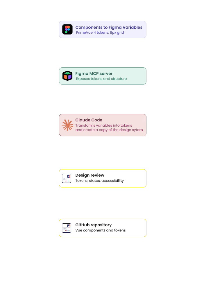
Once the Figma library was stable, I turned it into a source that an AI agent could read. Every UI element was defined as a Figma variable following the PrimeVue 4 token structure, so colors, spacing, radii, and typography existed as named values rather than visual decisions. Figma’s MCP server then exposed that structure to Claude Code, which could generate new layouts and components directly against the real tokens instead of approximating them.
The variables are also connected to the company’s GitHub repository, so a change made in Figma propagates to the codebase automatically. Design and development share one definition of the system, and new screens can be drafted in minutes while staying consistent with everything already shipped.
Outcome & Learnings
The redesign transformed Bidx into a more intuitive, scalable, and efficient platform. By simplifying navigation, streamlining key workflows, and introducing a consistent design system, users were able to complete tasks faster and with greater confidence. The new foundation also prepared the product for its migration to Vue, making future development more maintainable and scalable.
Throughout the project, I learned that successful enterprise products are driven less by visual improvements and more by workflow optimization. Close collaboration with users and stakeholders was essential to uncover real pain points, while building a structured design system ensured consistency across the platform and accelerated both design and development efforts.