


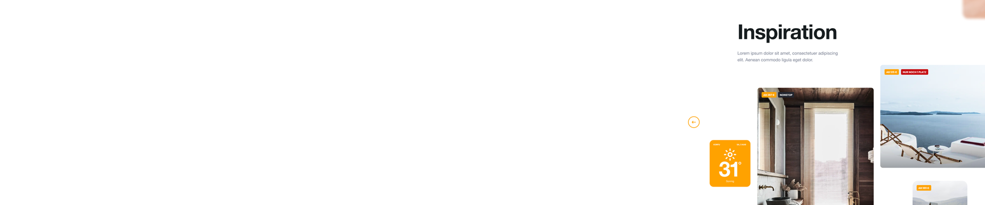
Condor (Pitch)
With the desire to gain more clients, I was part of the team for the presentation of the Pitch for this German airline. The airline’s intention was to create its website from scratch. As expected, the presentation included a large number of screens, which covered not only the typical process of purchasing travel tickets, but also a sample of what the brand can offer. The concept of well-being, kindness and aspirational.
Although I do not know the final result of the Pitch, it was a great team experience to use the brand elements of this renowned company and incorporate them into a modern design, and out of the conventions for an airline
Categories
- UI
Role
- UI designer
Duration
- 1 Month
Client
- Adesso SE, Condor Flugdienst GmbH
The aesthetics to follow
Although the company had recently renewed its corporate image, many elements of its website had not been clearly defined. Currently, its graphic concept follows minimalism in its shapes and colors, translated into ideas such as vacations, and sunny days. Their goal was to be unique and recognized.
After analysis with UX and Marketing methodologies, we came to the idea of breaking the design grid, using large white areas, and managing elements outside the grid, which would generate a feeling of freedom and distance. It was an opportunity to move away from focusing on ticket sales, but rather on the sites and options offered by the destinations to which one travels.
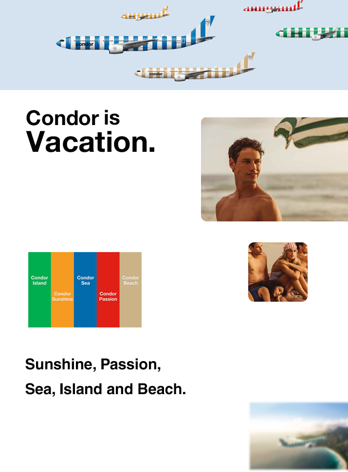
This was the presentation with the new corporate image. Its objective and concept are clearly seen.
My part
I was in charge of creating the templates for the most targeted destinations where Condor flies. Following the strategy, it was decided to use design cards, where photography had a great impact. The idea of presenting destinations as a product led to the creation of categories related to feelings of well-being and satisfaction. In addition, the idea is to create spaces where users could recommend destinations and show their experiences to attract the attention of new travelers.
Final deliveries
These screens were used in the final presentation. A part of the team created the animation for each of them.
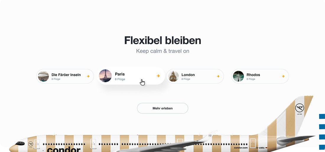
Module with the featured destinations, here we highlight how many flights there are each way
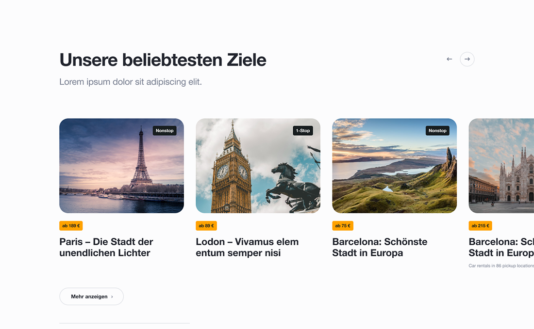
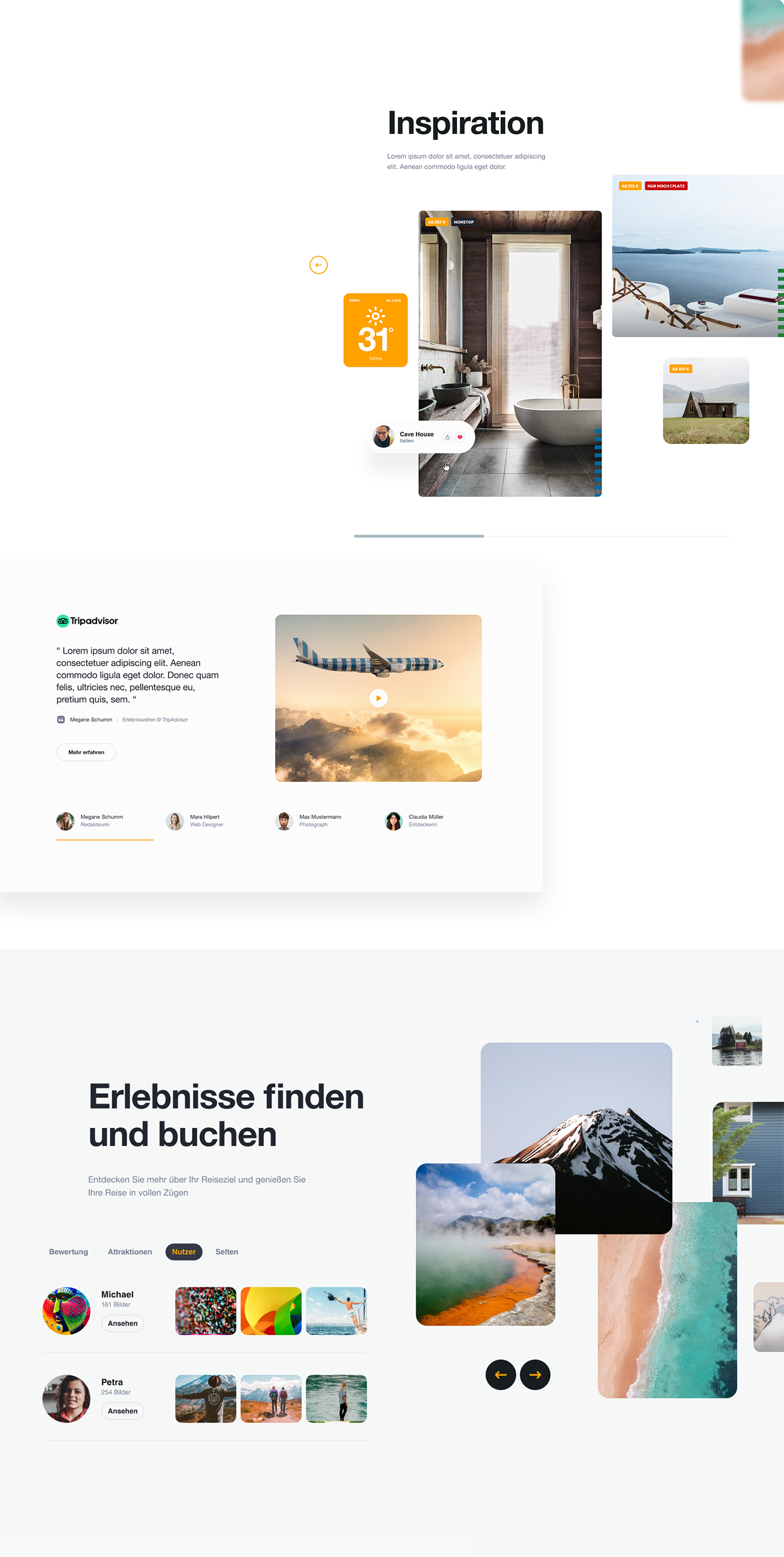
Module with the destinations preferred by users. It is an endless slider that is presented outside the grid. This contains: price, Headline and number of stops
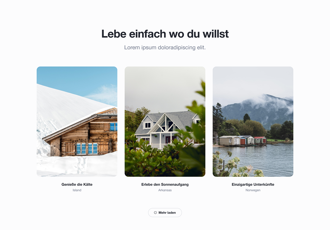
Gallery with the content of destinations for this new service where you can consult lodging places, this includes hotels, rest houses, etc.
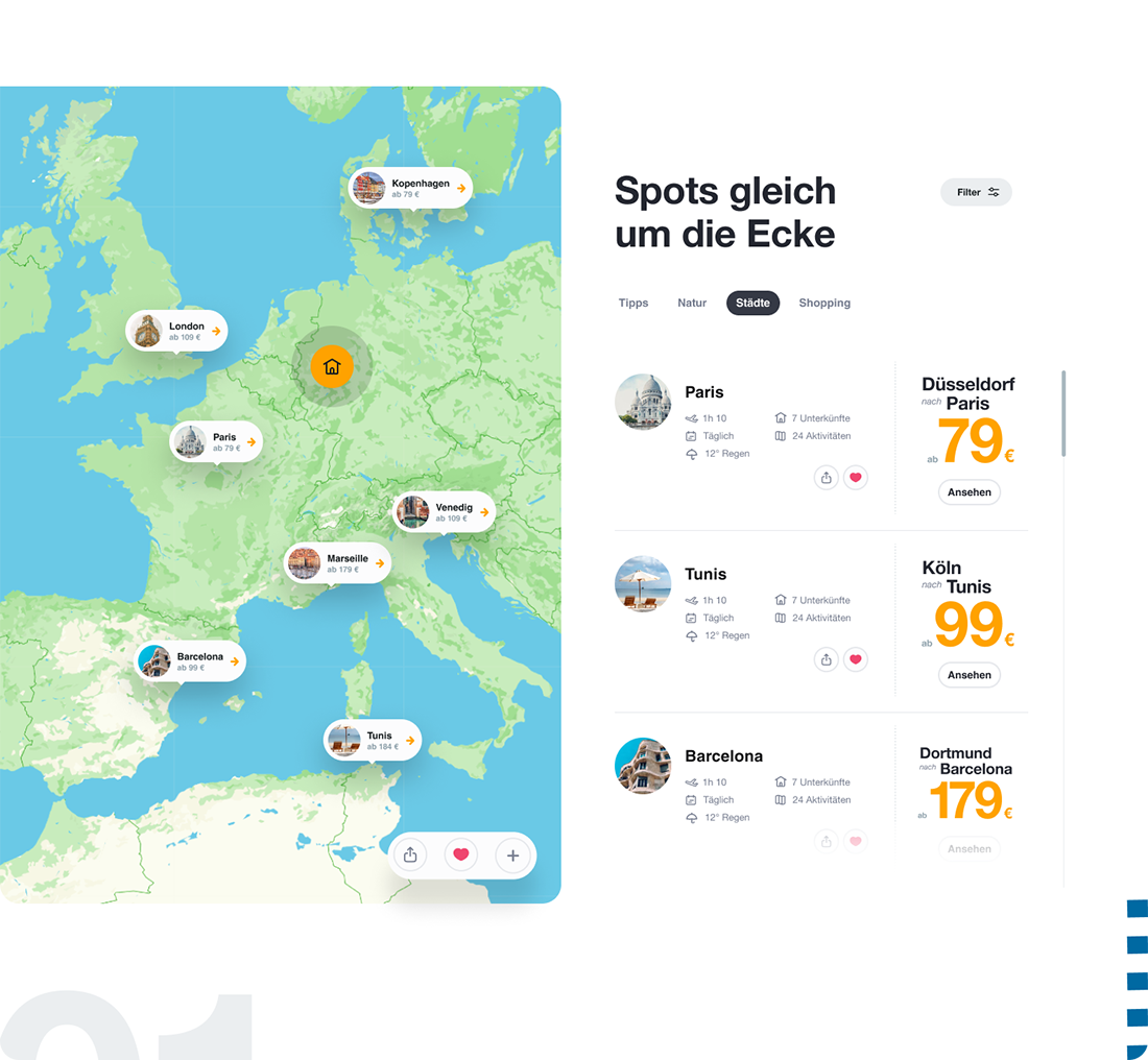
Map view for destinations near the user’s location. In this module, the categories created by the users themselves were used, which bring together the entire travel plan: flight, accommodation, and activities to do.
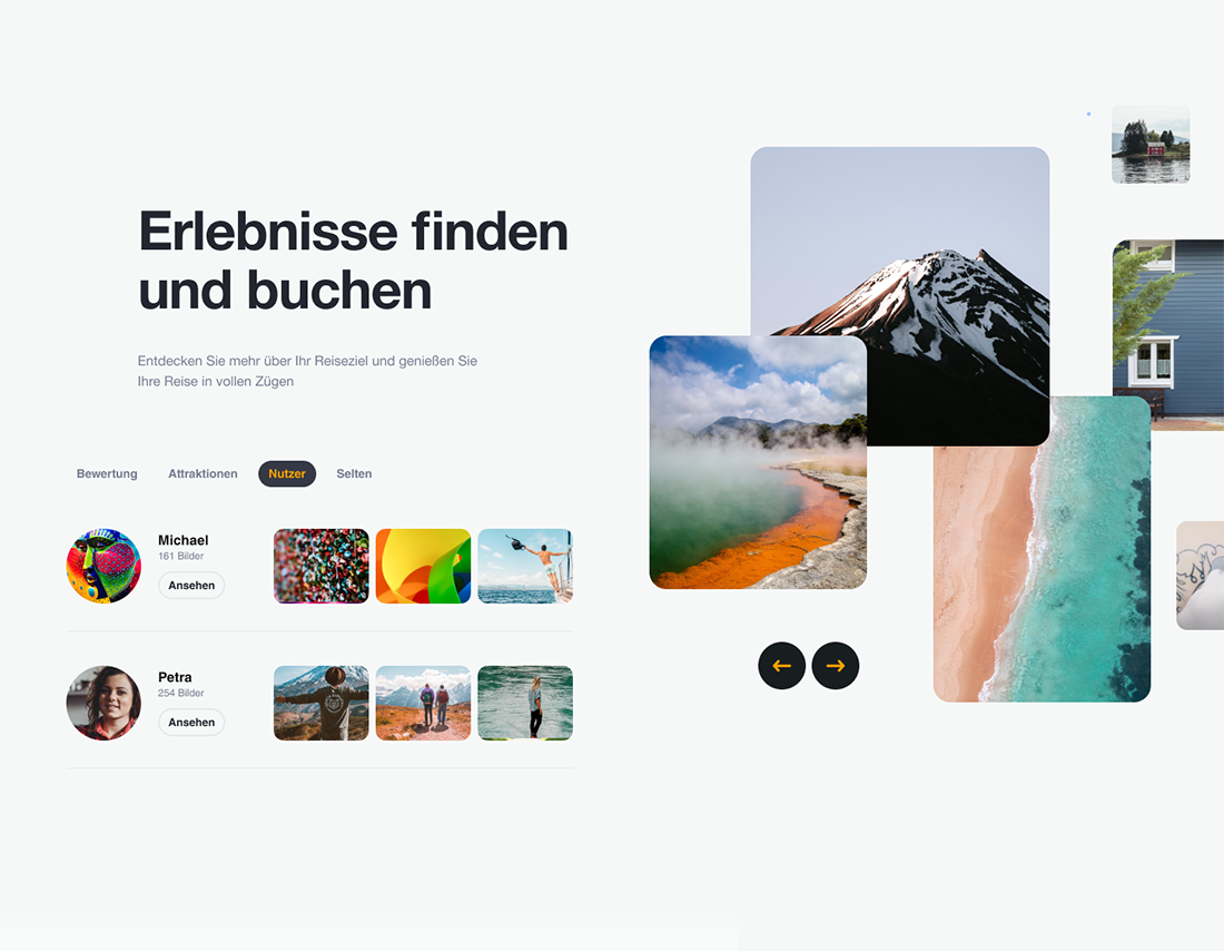
Experience search module. This module, in particular, focuses on ratings by users, attractions of each destination, those that users share (photos, Tips), and other types of categories such as “Rarely visited destinations”.
Its graphic presentation is based on slider-type navigation, with material uploaded by users.
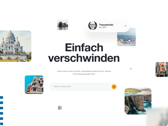
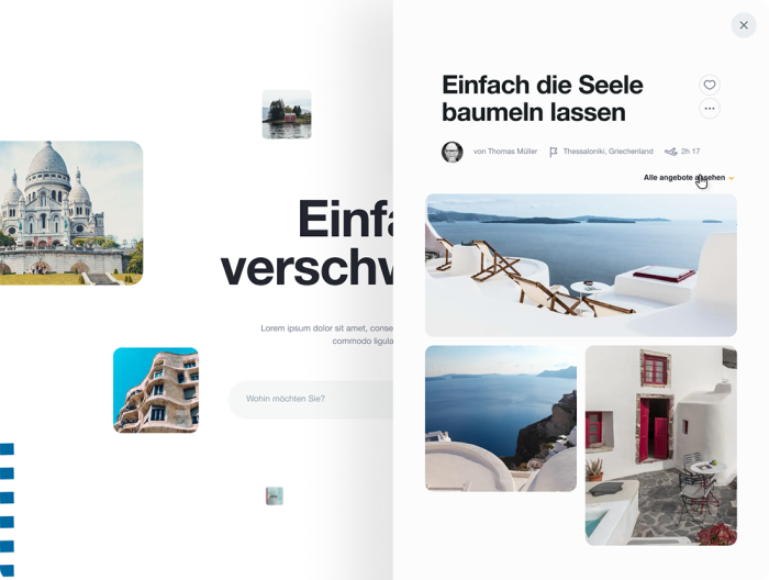
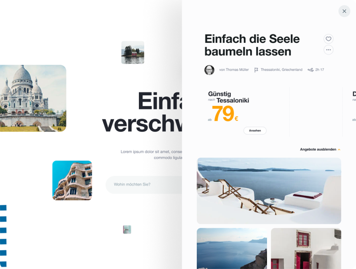
The destination search engine is also powered by user recommendations or from Condor itself. The focus is to show more of the experience than simply prices and distances to travel.
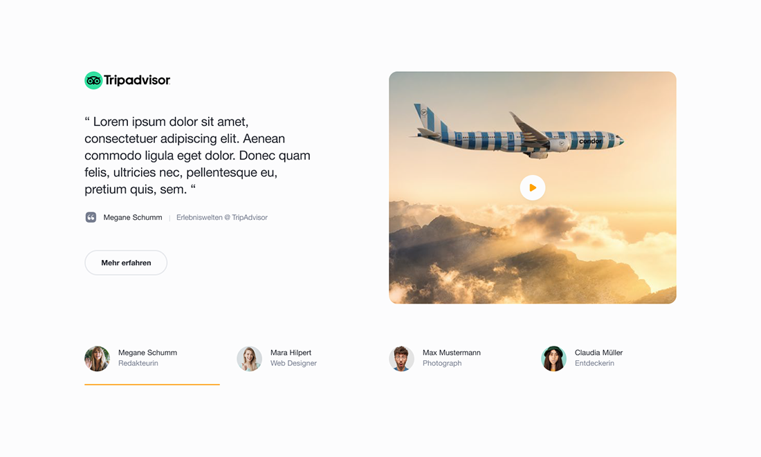
Continuing with the concept of content generated by the users themselves, this module was contemplated fed by services such as TripAdvisor or similar.
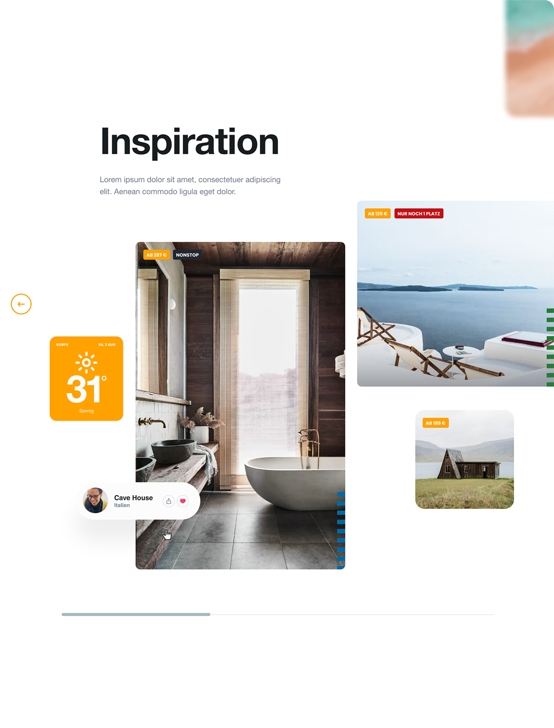
Module to promote destinations, this time the priority is photography, exalting the beauty of the place, and the temperature. In the background is the flight data. Once again we rescue the concept: what is important is experience and well-being.
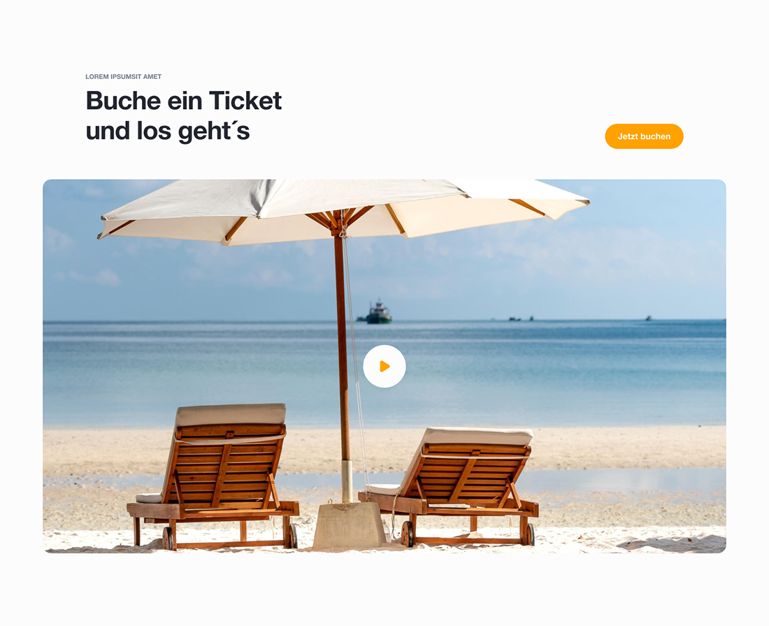
Of course this design proposal is far from any airline website. CTAs are no exception, experience has a great priority